Background: the Design
I love Flexbox--it's a fundamental in responsive design. As empowering a device as it is, though, it's not without it's limits. It just so happens that I work with a designer who has a real knack for exposing these limits. The minute I think I've got flexbox under control, she'll throw me a design that challenges my every conception of what flexbox is or how it should work. Let's look at a specific point and case--a design I was recently asked to build out:
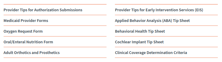
Here we've got a long unordered list (<ul>) of list items (<li>). To reduce vertical scrolling on desktop, the designer has opted to put the items into two columns. Whatever mechanism we use to render the columns, though, it needs to be scalable: we may need to add or subtract list items depending on content needs of the client.
It isn't a big challenge to force the list items into columns; it can be done by either adding flex-direction: row; or flex-direction: column;to the parent <ul> (although, the column option will likely need a fixed height and a rather clever JavaScript work-around if it's to be scalable). In either case the list items can be forced into two columns by giving them a width of, say, 48% (allowing for a 4% margin between the two columns). The real challenge, though, is that the designer has given both top and bottom borders to each list item.
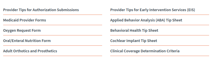
Now, we can't actually give top and bottom borders to each list item: that'll result in a big mess (don't believe me, just try it). The easiest way to start styling this is to simply give a border-bottom to each list item (i.e., ul li { border-bottom: 1px solid orange; }. That would produce a relatively even layout where all items except the top rows of each column appear to have both top and bottom borders--something like this:
The big question is this, then: how do we style out the first items in each column? The answer, and the complexity, depends on whether you're using flex-direction: row; or flex-direction: column;.
flex-direction: row;
If you're working with rows, you're in luck. When the flex-direction is set to row, flex-items (in our case, list items) will always order themselves left to right before top to bottom. This ensures that no matter how many items are added to our list, the top row items in both of our columns will always be the first and second list items. We can target both of these items for styling with minimal work--i.e., li:first-of-type { border-top: 1px solid orange }and li:nth-of-type(2) { border-top: 1px solid orange }. Problem solved; case closed.
However...
flex-direction: column;
If, on the other hand, you're working with columns and you need scalability, you're in for quite a challenge. First, before you dive into styling, you'll definitely want to review my article on how to force scalable flex columns with JavaScript. Assuming you're still with me after that, here's what you'll need to do:
The problem with scalable flex-columns is that the top list item in the second column won't be static--it's order will change depending on how many total list items you have. This means that you can't target the top item in the second column with nth-of-type(x).
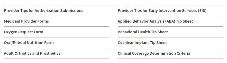
Rather, we'll need to, in a somewhat literal sense, think outside the box. Rather than style the top-row list items, we can style the parent <ul> instead--i.e., ul { border-top: 1px solid orange }. Here's what that gets us:
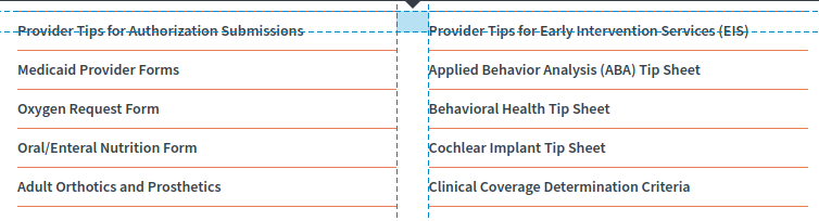
We're close. But how do we break the top border on the <ul> so that our columns stay intact? We can create a ::beforepsuedo-element, give it the same width and background color as the margin between our columns, and then absolutely position it so that it rests over the border. You'll want to be sure to set position: relative; on the parent <ul>.
The psuedo element only needs to be however many pixels tall your border is. Here I've given it a little extra height so that it's easier to see in my screen grab:
Once in place, your columns will be perfectly styled out. Since it makes sense to go single column for mobile, you'll likely want to remove the psuedo-element and the <ul> border-top for smaller screens. For mobile, you can go back to targeting the first list item. Otherwise, you're good to go: scalable flex-columns with some rather attractive border styling!
The Catch: Applying JavaScript to Handle Scaling
If you intend to use my fix for scaling flex columns, you'll want to take note of a small but important detail. In order make flex columns scalable (i.e., capable of overflowing from one column into another as list items grow) you need to give the parent a fixed height. Assuming you give the flex children a fixed height, you can use JavaScript to assign the parent's fixed height based on how many children are present. This allows the columns to grow and redistribute their content automatically. Here's the big caveat: since we've added a 1 pixel border to the parent, we'll need to account for that 1 pixel when JavaScript calculates the parent height. Refer to my notes in the JSFiddle below.